Summary Cards
Visible on both the Dashboard & All Data screens, Summary Cards show glanceable summaries of the displayed data.
If the data displayed is bounded by a date range - on the Dashboard, or by specifying a date range on the All Data screen - it will only show information for this range on the tile.
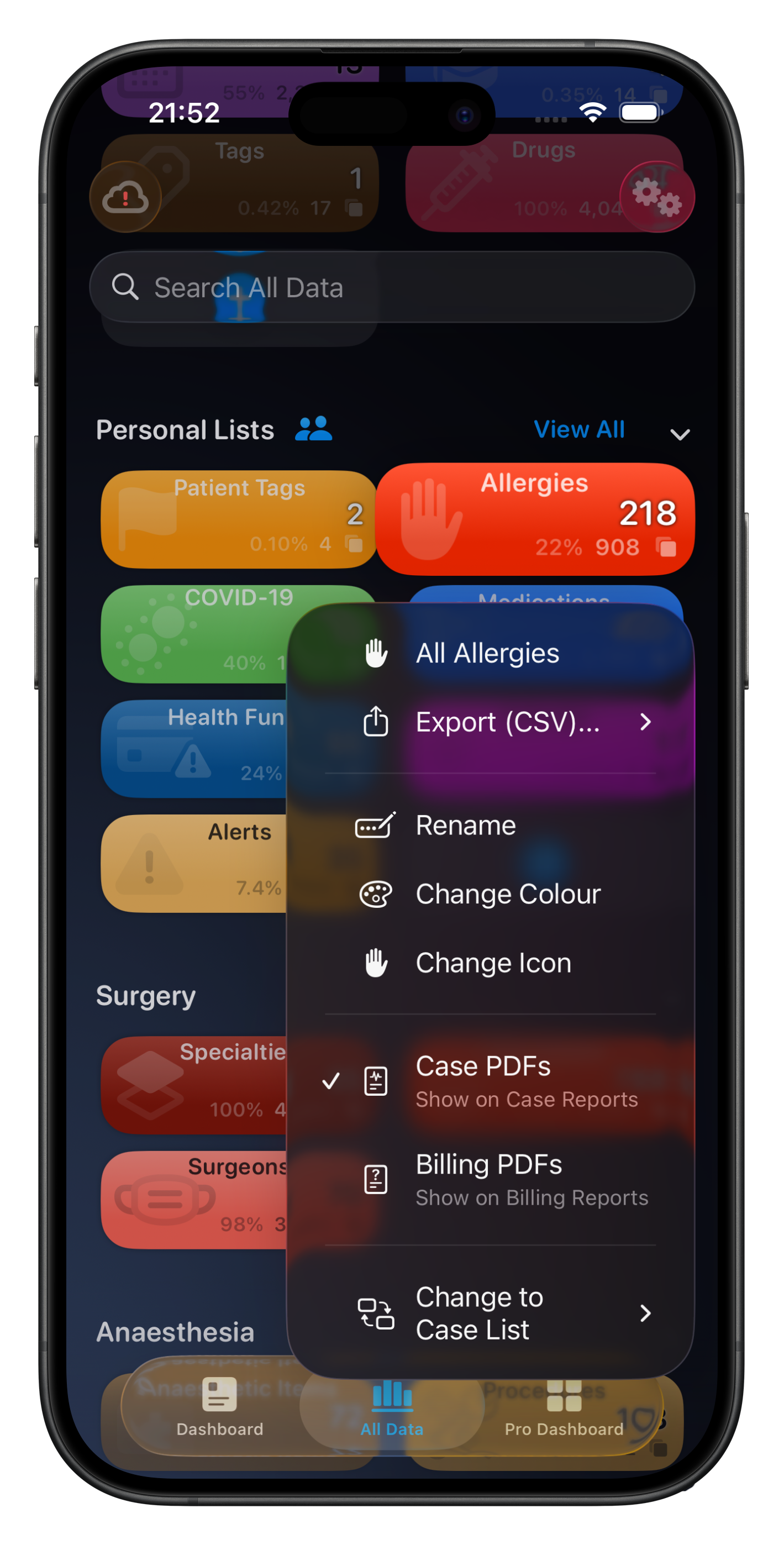
Tapping on a Summary Card will take you to a list of those items for that date range. Using the context menu (long press, or right-click on Mac) will give you more options, including:
Viewing all items, not just those bound by the displayed date range
Exporting displayed items, or all items in the list as a CSV file
Changing category colours
Changing icons, colours & list type for Personal Lists
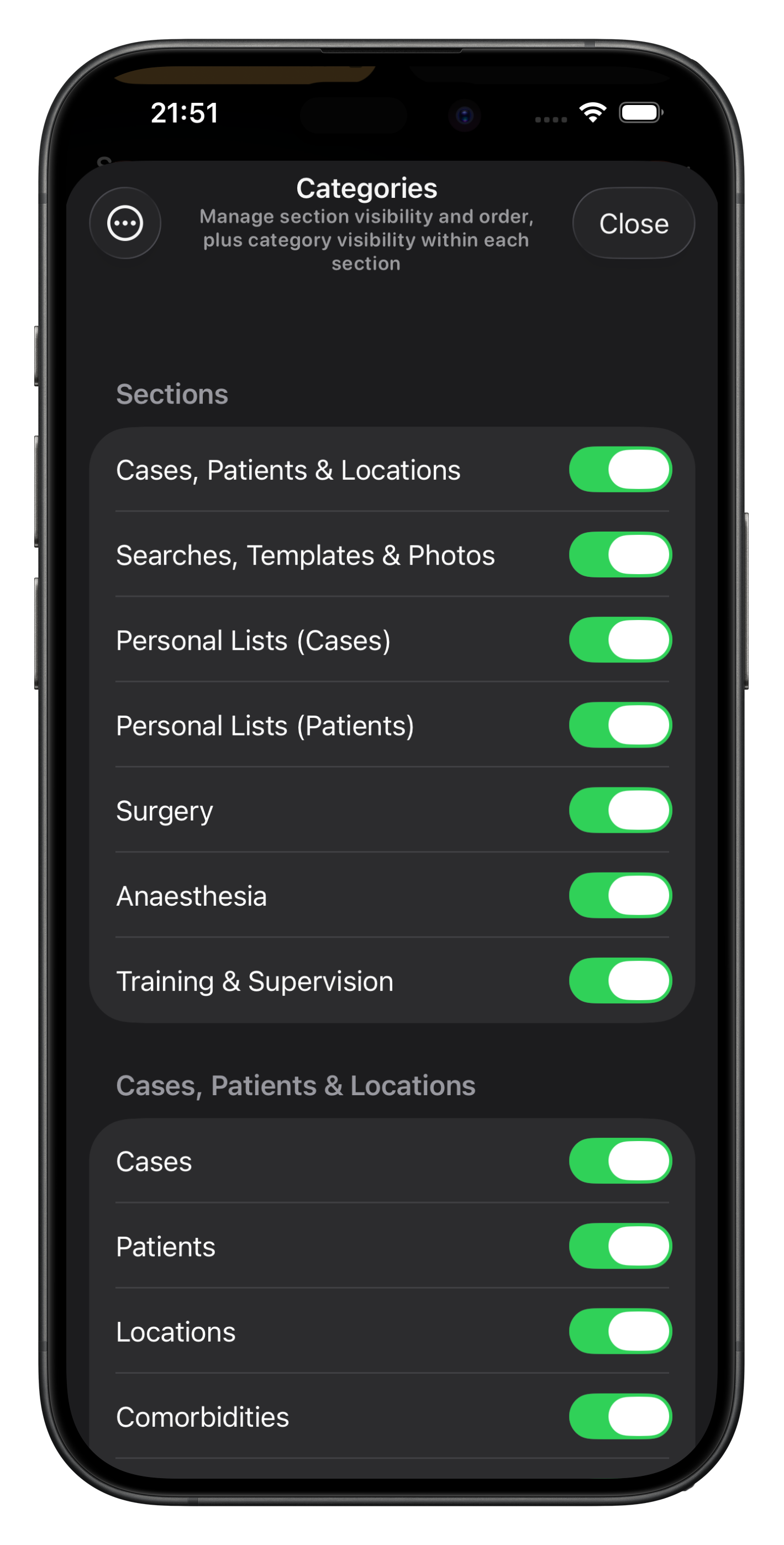
To adjust Summary Card visibility & order, tap on the Show/Hide Categories button.
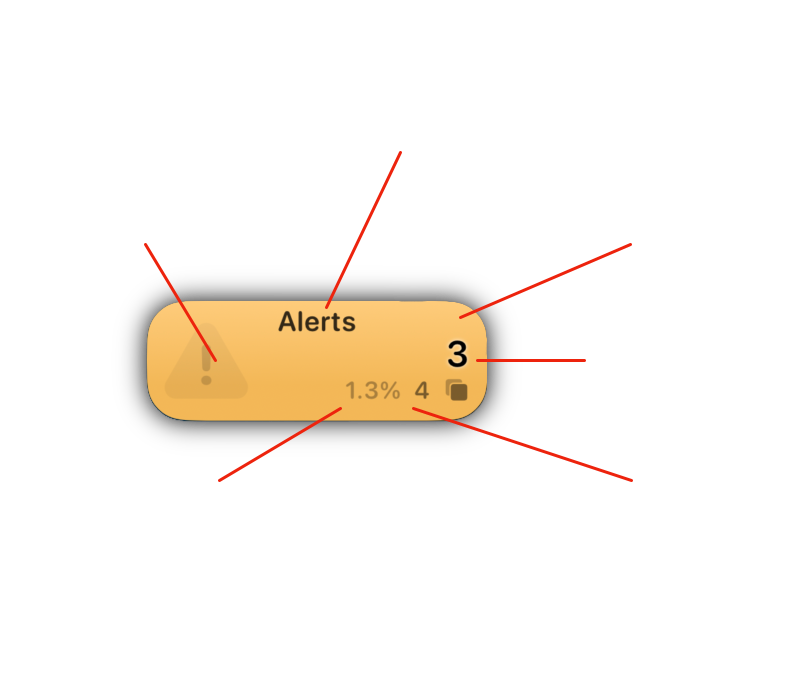
Anatomy of a Summary Card
Title
Default category names cannot be changed, but you can create Personal Lists with any name you like.
Icon
Personal List icons can be customised but default categories are static
Colour
Most categories & all Personal List colours can be customised
Item Count
This represents the number of items in that category that are linked to the Cases currently displayed.
Case Count
This represents the number of cases linked to items in this category. In this example, there are 4 cases, but 3 items used - one item in this scenario was used for two cases.
Case Count Percentage
This is the percentage of all cases visible in the selected date range that have any items in this category attached. In this example, there are a total of 313 cases in the range (selected by year on the All Data screen), and 4 of those cases have at least one Alert linked to them - ie 1.3% of 313 cases.
Viewing Data via Summary Card
Tapping or Clicking on a Summary Card will take you that category, with the items in the list and the cases (or patients) displayed bounded the date range, if relevant.
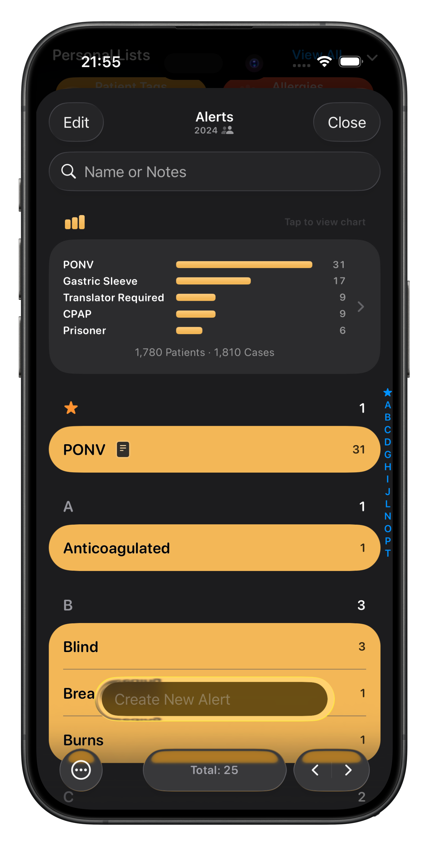
Here is a list of Alerts bounded by year (2024). While this Alerts personal list has many more items in it, only these ones are used for cases in 2024.
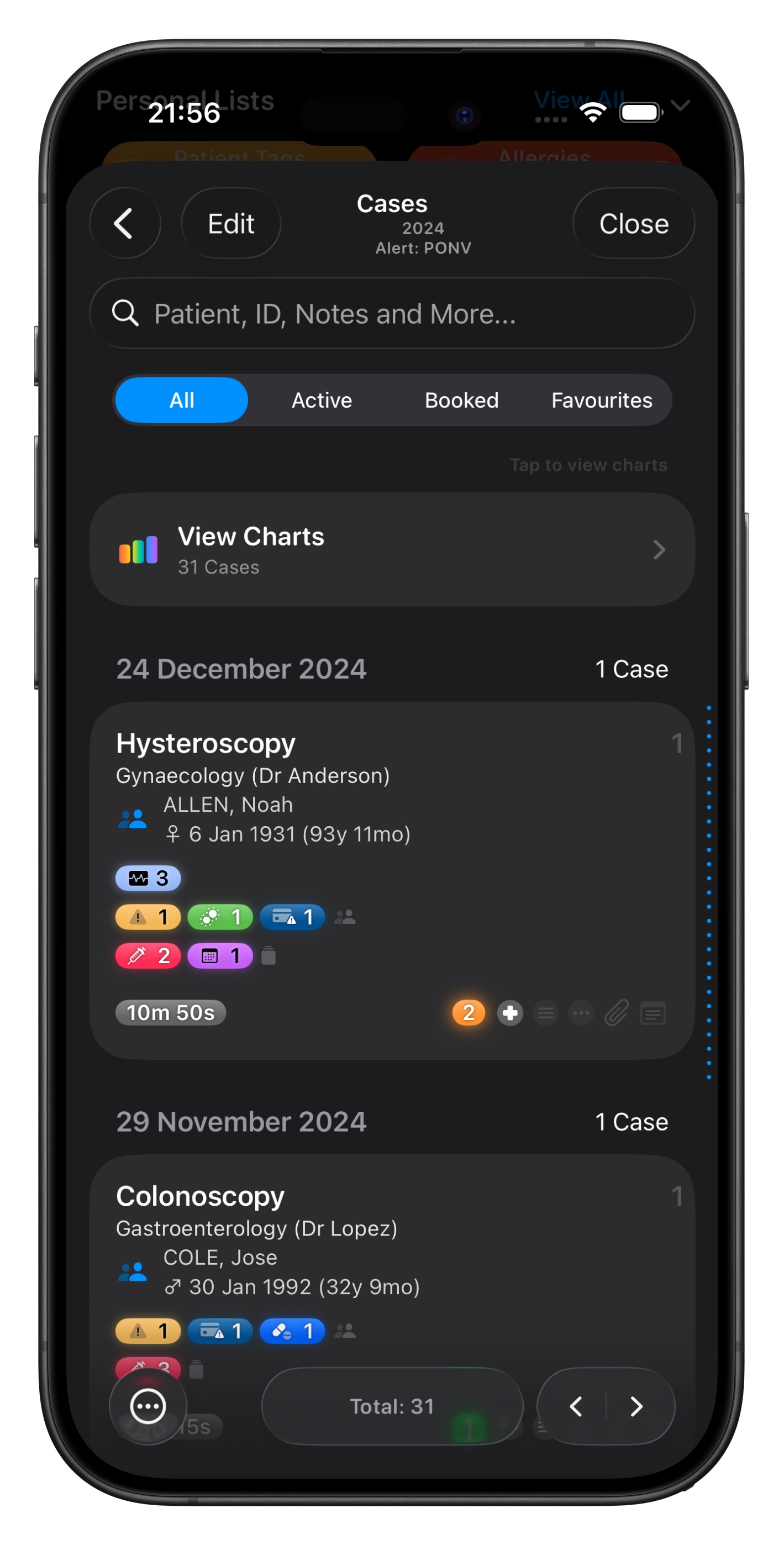
Tapping on a row will take you to the list of cases for that particularly Alert, bounded by the same date range.
This is an advanced way to view & analyse your data. And of course, you can export all the cases using the menu button at the bottom left.